
Enhancing Network Monitoring of Grandstream Access Points using Elastic (ELK) Stack
Hey there, tech enthusiasts and network pros! If you’re like us, you know that keeping a company’s Wi-Fi network running smoothly is no small feat. At Qavi Tech, we’ve got a bustling team relying on reliable connectivity every day, and that’s where our latest innovation comes in: a custom dashboard built on Kibana using Logstash for monitoring and gaining insights into our access points (APs). This tool has been a game-changer for us, helping spot issues fast, optimize performance, balance user loads, and ensure our Wi-Fi stays rock-solid. In this blog, we’ll break it down for you—why we did it, how we made it happen (with a deep dive into the visualizations that bring it all to life), and the awesome benefits it’s bringing to our team. Let’s dive in!
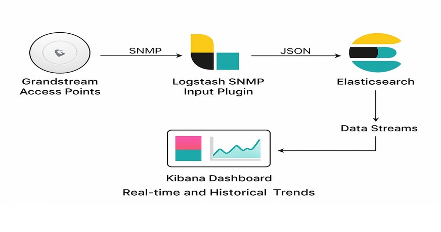
Architecture Overview:
Data Flow:
SNMP (Simple Network Management Protocol) is used to collect interface and system metrics from the Grandstream access points.
Logstash SNMP Input Plugin polls OIDs periodically (every interval) and converts data into structured JSON.
Data is then indexed into Elasticsearch using data streams.
Kibana Dashboard visualizes real-time and historical trends of traffic and device health.
Why We Built This Dashboard
In the fast-paced world of tech, downtime isn’t an option. Our access points are the backbone of our internal network, connecting everything from laptops in meetings to IoT devices in the lab. But like any network, ours wasn’t immune to hiccups—random drops in signal strength, overloaded APs during peak hours, or sneaky performance bottlenecks that only showed up under heavy use.
We realized we needed more than just reactive fixes. Traditional monitoring tools were okay, but they often buried us in raw data without clear, actionable insights. Why sift through logs manually when we could have a system that visualizes everything in real-time? The goal was simple: empower our IT team to proactively manage the network, prevent issues before they escalate, and keep everyone productive. Plus, with remote work on the rise, ensuring seamless Wi-Fi has become even more critical for collaboration and efficiency. Building this dashboard was our way to turn data into decisions, making network management less of a headache and more of a strategic advantage.
How We Built It: A Step-by-Step Peek, Including Our Key Visualizations
Don’t worry, we are going to geek out too hard here – this is a high-level overview so you can get inspired to try something similar. We leveraged Elastic Stack’s ecosystem, specifically Kibana for visualization and Logstash for data processing, because it’s powerful, open-source, and scales well with our setup. The dashboard pulls in real-time metrics from our Grandstream access points, like CPU, memory, disk usage, client connections, signal strength, and network traffic – all processed through Logstash pipelines for filtering and enrichment before hitting Elasticsearch indices.
We designed the dashboard with a modular layout: overview tables at the top for quick scans, detailed charts in the middle for trends, and bottom sections for traffic and client deep-dives. Each visualization was created using Kibana’s drag-and-drop tools – starting with aggregations on our indexed fields (e.g., timestamp, AP_name, cpu_usage_pct), then layering in filters for floors or time ranges.
Here’s a closer look at some standout visualizations, what they show, and how they’re helping our team stay ahead:

Resource Monitoring: CPU, Memory, and Disk Usage Panels
What We Made We created compact gauge cards, ranked tables, and multi-line time-series charts to track hardware resource utilization across all APs. Memory panels show percentage used with trend lines for used/free/total capacity. CPU and disk sections use horizontal bar rankings and overlaid time-series to reveal usage patterns over hours or days.
What It Shows A real-time health snapshot of each AP’s processing power, memory load, and storage consumption, with historical trends to reveal peak usage windows.
How It Helps the Team We instantly identify resource-intensive APs and predict potential failures. This enables proactive load balancing, firmware updates, or hardware refreshes – preventing slowdowns and extending device lifespan without guesswork.

What We Made A dynamic summary table lists all APs with key metrics: location, status, uptime, connected clients, band usage (2.4/5GHz), and upload/download rates. Below it, a pie chart segments clients by device type and OS, while floor-level bars and a time-series line track client distribution and growth.
What It Shows Total connected devices, per-AP load, device ecosystem breakdown, and real-time shifts in user density across office floors.
How It Helps the Team We optimize client steering and channel planning. During high-traffic periods, we redistribute users to underutilized APs, reduce congestion, and improve connection quality – especially for mobile-heavy teams.
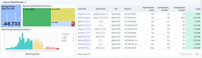
What We Made Stacked bar charts display signal quality distribution across all clients (Excellent, Good, Fair, Poor). A histogram plots signal strength in dBm ranges, and a detailed table maps signal tiers to specific APs and devices.
What It Shows Network coverage quality, dead zones, and signal degradation patterns – highlighting which areas or device types experience weaker connections.
How It Helps the Team We prioritize physical adjustments (AP relocation, antenna alignment) or configuration tweaks (power settings, channel interference mitigation). This ensures consistent, high-quality Wi-Fi for hybrid and in-office users alike.
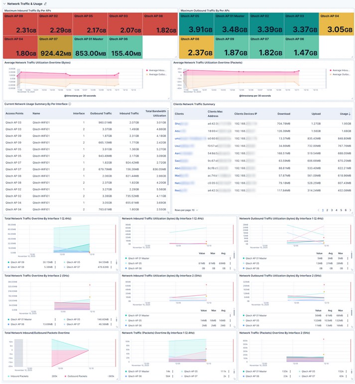
What We Made Horizontal bar charts rank APs by total upload/download volume. Stacked area charts track inbound/outbound traffic over time per interface (2.4GHz and 5GHz). Packet flow lines and utilization heatmaps reveal bandwidth trends and spikes.
What It Shows Traffic hotspots, peak usage times, and band-specific performance – down to per-minute granularity.
How It Helps the Team We forecast capacity needs, enforce QoS policies for critical apps (like VoIP or video), and prevent bandwidth saturation. This keeps latency low and supports seamless collaboration, even during all-hands meetings.
We built this dashboard iteratively—starting with core metrics, then adding advanced filters and alerts. Kibana’s flexibility means we can evolve it as our network grows.
This isn’t just a dashboard – it’s a force multiplier for our team. Here’s what we’ve achieved:
- Faster Issue Detection: Problems are flagged in minutes, not hours. Mean time to resolution (MTTR) is down over 50%.
- Proactive Performance Tuning: Load balancing and signal optimization have boosted average Wi-Fi speeds and cut complaints by 25%.
- Smarter Infrastructure Planning: Data-driven insights guide AP upgrades and placements, optimizing budget and coverage.
- Cross-Team Visibility: Developers, managers, and support staff now understand network status without needing IT jargon.
- Future-Ready Foundation: The system scales effortlessly and supports ML-based anomaly detection—we’re already planning predictive alerts.
We’re all about leveraging tech to make life easier, and this Kibana-Logstash dashboard is a prime example. By addressing the “why” (proactive management in a demanding environment), nailing the “how” (smart data pipelines and visualizations like our resource trackers and traffic flows), and reaping the benefits (speed, reliability, and efficiency), we’ve leveled up our network game. If you’re dealing with similar challenges, we highly recommend giving this a shot – it could be the upgrade your setup needs.
Got questions or want to share your own monitoring stories? Drop a comment below or reach out—we’d love to chat! Stay connected, folks.