Zabbix 8.0 is shaping up to be one of the most important releases for teams that rely on open-source monitoring, infrastructure visibility, and enterprise observability. While Zabbix 8.0 LTS is planned for Q3 2026, Zabbix 8.0.0beta1 was made available on May 22, 2026, giving engineering teams a practical opportunity to test new capabilities before the final LTS release.
For observability teams, the most important part of Zabbix 8.0 is not just “more monitoring.” The bigger story is how Zabbix is improving dashboard usability, metric comparison, visual troubleshooting, and telemetry analysis. These are the areas where monitoring platforms either become genuinely useful-or turn into noisy screens nobody trusts during an incident.
As an official Zabbix Authorized Reseller, Qavi Tech helps organizations design, deploy, optimize, and scale monitoring environments built around Zabbix. That makes Zabbix 8.0 especially relevant for teams planning new monitoring architectures, dashboard modernization, or long-term observability improvements.
Why Zabbix 8.0 Matters
Zabbix has long been used for infrastructure, server, network, cloud, application, database, and service monitoring. Zabbix 8.0 continues from Zabbix 7.4 and adds new features across the frontend, widgets, templates, data collection, and dashboard experience.
The release also fits into a broader shift in monitoring. Teams no longer want dashboards that only display raw metrics. They need dashboards that help them compare signals, spot relationships, identify outliers, and understand what changed quickly.
That is where Zabbix 8.0’s visualization improvements become useful.
1. Scatter Plot Widget for Metric Relationships
One of the most notable additions in Zabbix 8.0 is the new Scatter plot widget. The scatter plot displays the relationship between two metrics by plotting individual data points along an X and Y axis. This helps reveal patterns, clusters, correlations, and outliers in a dataset.
That matters because many infrastructure issues are not obvious when metrics are viewed separately.
For example, CPU usage alone may not explain an application slowdown. Network throughput alone may not explain packet drops. Disk I/O alone may not explain delayed response times. But when two related metrics are plotted together, teams can often see whether one signal is moving with another.
Practical use cases include:
- Comparing CPU usage against response latency
- Comparing memory consumption against request volume
- Comparing network throughput against interface errors
- Comparing database connections against query time
- Comparing host load against application performance
- Comparing application throughput against backend saturation
- Comparing queue depth against processing latency
This makes scatter plots useful for troubleshooting, capacity analysis, performance correlation, and operational review.
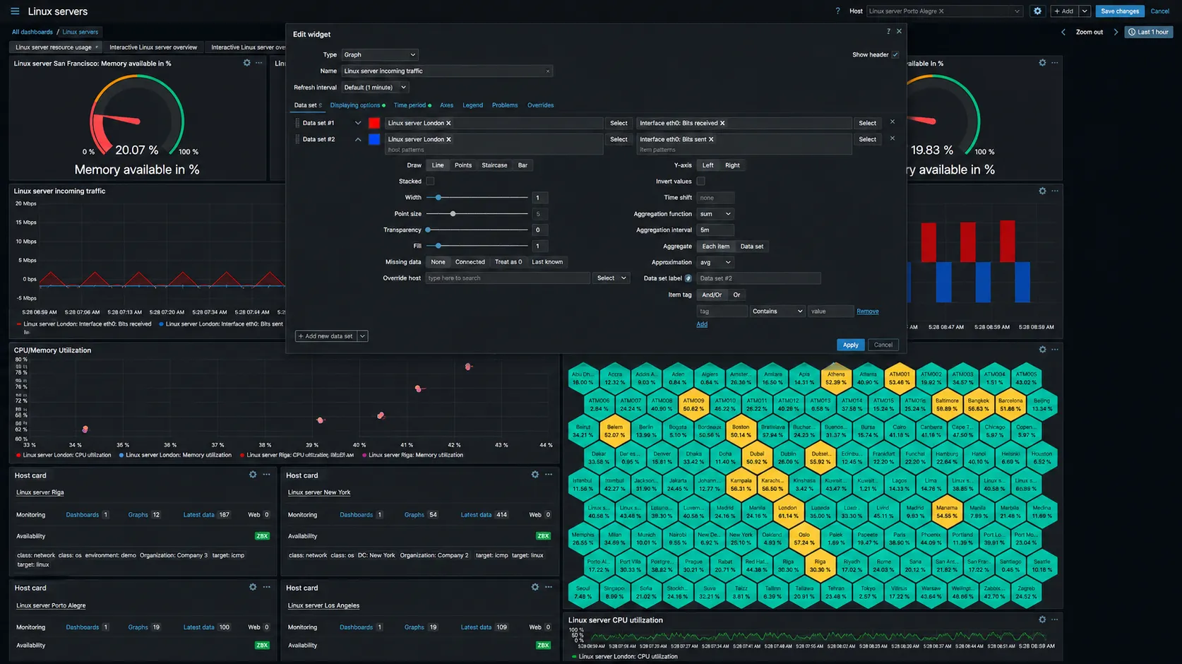
2. Inverted Y-Axis Values for Cleaner Metric Comparison
Zabbix 8.0 also introduces Y-axis inversion for the Graph widget. The new “Invert values” setting allows a graph to multiply Y-axis values by -1 visually without changing the original data.
This is especially useful when comparing two related metrics that move in opposite or complementary directions.
A simple example is network tra
- Bits received
- Bits sent
Without inversion, both metrics may appear on the same side of the graph and overlap visually. With one metric inverted, incoming and outgoing traffic can be shown on opposite sides of the X-axis. The result is easier to read because the graph becomes a mirrored comparison instead of a crowded overlay.
This is not just cosmetic. In real operations work, faster visual comparison means faster interpretation. During an incident, that matters.
For network operations, inverted graphs can help teams compare inbound and outbound traffic patterns more clearly. For infrastructure teams, the same approach can be useful when comparing related resource metrics, such as read/write activity, request/response behavior, or paired utilization patterns.
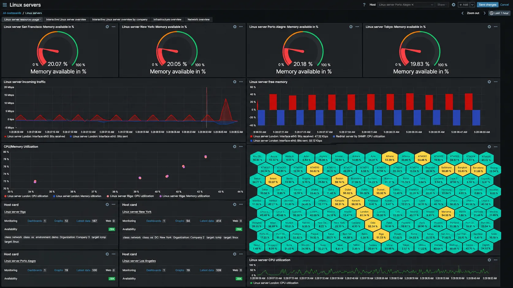
3. Better Graph Highlighting and Tooltip Behavior
Zabbix 8.0 improves the Graph widget experience by making interactive graph analysis easier. Hovering over a graph displays a tooltip sorted by value. Hovering over an item highlights its graph while dimming others. Selecting an item can also broadcast its data to other widgets.
This improves usability when a dashboard contains multiple hosts, interfaces, services, or item patterns.
The old dashboard problem is familiar: too many lines, too many colors, too much noise. Highlighting helps operators focus on the one metric they care about without removing the surrounding context. Broadcasting selected item data to other widgets also opens the door to more connected dashboards, where one selection can influence what other widgets display.
For teams managing large environments, this is a meaningful improvement. It reduces visual friction and helps engineers move from “something looks wrong” to “this specific metric needs attention” faster.
4. Customizable Tables for Faster Investigation
Zabbix 8.0 adds customizable tables in several frontend sections, including Templates, Hosts, Latest data, and Problems. Users can show, hide, reorder, and resize columns in those tables.
This sounds minor until you look at how monitoring teams actually work.
During troubleshooting, every unnecessary column is friction. Every missing column is another click. Customizable tables allow teams to shape the interface around their operational priorities instead of forcing everyone into the same default view.
For example:
- NOC teams may prioritize host status, severity, and last check time.
- Infrastructure teams may prioritize templates, interfaces, and availability.
- Security teams may prioritize tags, host groups, and event context.
- Platform teams may prioritize service ownership and environment metadata.
- Managed service teams may prioritize customer, region, environment, and SLA-related fields.
Better table customization means less time fighting the UI and more time investigating the issue.
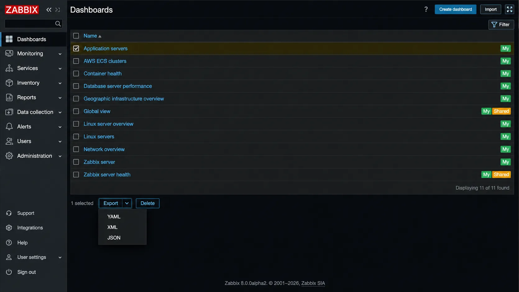
5. Dashboard Export and Import
Zabbix 8.0 also introduces dashboard export and import, allowing selected dashboards to be saved as YAML, JSON, or XML files and later imported into another Zabbix instance.
This is important for teams that manage multiple environments.
Instead of manually rebuilding dashboards across development, staging, production, and customer environments, teams can standardize dashboard layouts and move them between instances more reliably. That is useful for enterprise monitoring teams, managed service providers, platform teams, and organizations with distributed infrastructure.
Dashboard export and import also supports better governance. Teams can version-control dashboard definitions, maintain reusable monitoring templates, and reduce inconsistency across environments.
What This Means for Observability Strategy
The direction is clear: Zabbix is moving beyond basic monitoring screens and toward more usable observability workflows. The roadmap for Zabbix 8.0 LTS also includes broader observability-focused work, including OpenTelemetry data collection, OpenTelemetry data visualization, and optimized telemetry storage.
That does not mean Zabbix replaces every observability platform. It means Zabbix is becoming more serious about modern monitoring and telemetry workflows.
For many organizations, the real question is not “Zabbix or Elastic?” or “Zabbix or another observability stack?” The better question is:
Which system should own which part of the observability workflow?
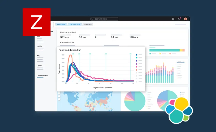
Zabbix can be strong for infrastructure monitoring, network monitoring, alerting, service visibility, and operational dashboards. Elastic-based observability stacks are often used for log analytics, search-driven investigations, application observability, SIEM, and large-scale data exploration.
Qavi Tech works with organizations across Zabbix, Elastic Stack, Kibana, Elastic Observability, Elastic SIEM, Wazuh, and related monitoring and search architectures. That matters because modern observability is rarely solved by a single tool. Infrastructure monitoring, logs, metrics, traces, dashboards, alerting, and security workflows need to fit together.
A poorly integrated observability stack creates more noise. A properly designed one gives teams faster answers.
Should You Test Zabbix 8.0 Now?
If you are already using Zabbix, testing Zabbix 8.0 in a non-production environment is worth considering. The beta release gives teams a chance to evaluate new dashboards, visualization behavior, templates, frontend changes, and upgrade implications before the LTS version lands.
But the key phrase is non-production.
Zabbix 8.0 should not be treated as a production-ready LTS release until the final release is officially available. Teams should use the beta phase to test functionality, validate compatibility, review dashboard behavior, and prepare migration plans.
A proper test plan should include:
- Reviewing current templates and integrations
- Testing dashboard behavior with real historical data
- Validating custom scripts, items, triggers, and discovery rules
- Checking frontend usability for operations teams
- Reviewing performance impact in a controlled environment
- Documenting upgrade risks before production rollout
This is where working with an experienced Zabbix implementation team matters. The risk is not just whether the software installs successfully. The real risk is whether the monitoring environment remains accurate, maintainable, and useful after the upgrade.
How Qavi Tech Can Help
Qavi Tech helps organizations plan, deploy, optimize, and manage monitoring environments built around Zabbix. As an official Zabbix Authorized Reseller, Qavi supports teams that need more than a basic installation.
That includes:
- Zabbix architecture design
- Zabbix deployment and configuration
- Dashboard and visualization development
- Template customization
- Network, server, cloud, database, and application monitoring
- Alerting and escalation design
- Performance tuning
- Upgrade planning
- Integration with log analytics and SIEM platforms
- Managed monitoring support
For teams evaluating Zabbix 8.0, Qavi can help test the release safely, identify what features matter, and design a monitoring roadmap that fits real operational needs.
Final Thoughts
Zabbix 8.0’s new visualization features are practical, not flashy. Scatter plots help teams see relationships between metrics. Inverted graph values make comparisons easier. Graph highlighting reduces visual noise. Customizable tables make investigation faster. Dashboard export and import make standardization easier.
That is exactly the kind of improvement monitoring tools need.
The best monitoring platform is not the one with the most charts. It is the one that helps engineers understand what is happening quickly, clearly, and accurately. Zabbix 8.0 moves in that direction.
For organizations planning observability modernization, the right approach is to evaluate Zabbix 8.0 as part of a larger monitoring architecture-not in isolation. Infrastructure monitoring, logs, traces, metrics, dashboards, alerting, and SIEM workflows all need to fit together.
That is where a properly designed observability strategy matters-and where Qavi Tech can help.
Team Qavi Tech