1. Introduction
Kibana sits at the heart of the Elastic Stack, helping analysts, engineers, and decision-makers turn messy raw logs, metrics, and traces into visuals that actually make sense.
As datasets grew in complexity, users began seeking more control over dashboards usability. While Kibana dashboards are powerful, in order to fulfill user needs at times they could feel a bit rigid for adjusting data on the fly using built in features and options.
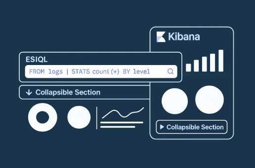
That’s where Kibana version 9.1.1 comes in introducing ES|QL Controls & Visualizations and Collapsible Sections.
With ES|QL Controls, you can actually reshape your data in real time without having to rebuild everything. And Collapsible Sections help organize data and insights in a way that keeps your visuals clean and focused – you can tuck away the extra details when you don’t need them, but they’re still there when you do.
2. ES|QL Controls – The Next Evolution of Filters
Kibana’s dashboard controls were like your friendly coffee shop menu you could choose from a list (dropdown), pick a range (slider), or select multiple options. These controls worked well for straightforward filtering: they acted directly on indexed fields, giving you instant results in your visualizations.
But there was a catch these controls couldn’t cater complex business logic. They were limited to showing or hiding data based on direct matches.
Now, instead of binding your controls to fixed, pre-indexed fields, you can use them as dynamic parameters inside ES|QL queries. This unlocks a completely new layer of flexibility:
- Filter based on calculated fields that don’t exist in your index.
- Apply aggregations before filtering, so the control influences pre-processed data.
- Chain multiple transformations so that a single selection can reshape the dataset entirely.
3. Collapsible Sections – Tidying Up Dashboards
Annotations have long been one of Kibana’s most underrated storytelling tools. They let you layer context onto your charts product launches, incident reports, campaign starts, or even system upgrades. These notes give your data a heartbeat, connecting numbers to real-world events.
However, as dashboards grew richer and timelines became busier, too many visible annotations could start to clutter the visual space. A long list of overlapping markers sometimes made the story harder, not easier, to read.
Kibana 9.1.1 introduces the Collapsible Section a simple but powerful improvement. You can now group visualizations into separate sections and let users expand or collapse them as needed.
Imagine you’re running a long-term monitoring dashboard:
- The Ops Team cares about system outages and patch releases.
- The Marketing Team is focused on product campaigns and customer spikes.
- The Finance Team looks at pricing changes and fiscal year events.
With collapsible sections, each team can focus only on visualizations relevant to them, keeping the dashboard clean and purposeful for everyone.
4. Real-World Examples
4.1 ES|QL Controls – Ecommerce Analysis
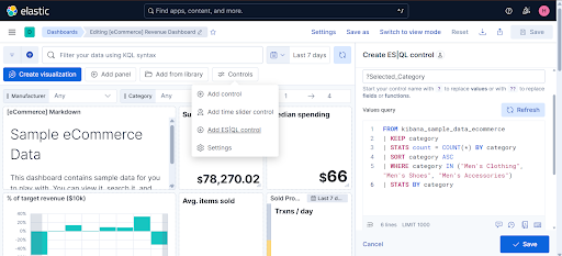
Let’s say you have the Elastic eCommerce sample dataset and you want to make your dashboard tell a more interactive story. Instead of a static category filter, you create an ES|QL Control that populates all available product Men’s categories
Step 1 – Create the ES|QL control
In Kibana’s Controls editor:
- Control Type: Dropdown
- ES|QL Query:
FROM kibana_sample_data_ecommerce
| KEEP category
| STATS count = COUNT(*) BY category
| SORT category ASC
| WHERE category IN (“Men’s Clothing”, “Men’s Shoes”, “Men’s Accessories”)
| STATS BY category
- Control Variable Name: Selected_Category
Step 2 – Use the variable in a visualization query
FROM “kibana_sample_data_ecommerce”
| WHERE category == ?Selected_Category
| EVAL estimated_cost = taxless_total_price * .25
| EVAL profit_amount = taxless_total_price – estimated_cost
| STATS
Total_Revenue = SUM(taxful_total_price),
Total_Profit = SUM(profit_amount)
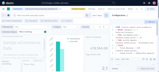
Now, when you pick a category from the control, Kibana passes that selection into ?Selected_Category, dynamically recalculating Total_Revenue and Total_Profit on the fly.
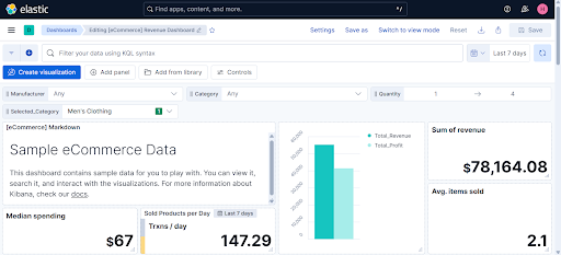
Your dashboard feels alive a single dropdown selection changes not just what you see, but how the data is computed.
4.2 Collapsible Sections – Cleaner Incident Tracking
Consider a metrics overview dashboard where you’re tracking system performance from multiple angles:
- Section 1: CPU Usage spikes, sustained high load periods, and unusual processing patterns that could signal performance bottlenecks.
- Section 2: Memory Usage tracking memory consumption trends, identifying leaks, and monitoring for out-of-memory risks.
By grouping annotations this way, you can collapse irrelevant sections and focus only on the events that matter at that moment keeping the visual space clean while still preserving historical context.
Benefits:
- Cleaner dashboards
- Easier navigation
- A better storytelling flow
Click below and see how it works 👇
https://drive.google.com/file/d/14tRLfx57UHgOrVBhSyQM4CiOCqDfIGys/view?usp=sharing
5. Conclusion
With ES|QL, you can create filter controls that are tailored to each user, letting them shape their own dashboard experience instead of merely slicing static data. Collapsible Sections keep visualizations clean and focused context is always there when needed. Together, they make dashboards not just informative, but intuitive and adaptable. In the evolving landscape of data analytics, this release marks a step toward Kibana dashboards that could be as dynamic as the data they represent.