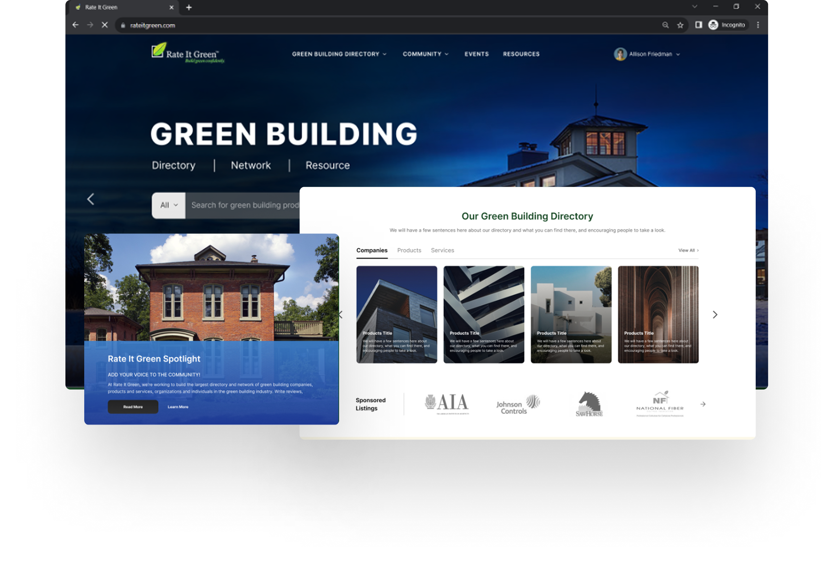
Rate It Green is a platform dedicated to connecting professionals, organizations, and enthusiasts in the green building industry. The redesign initiative focused on transforming the experience into a more engaging, accessible, and content-driven hub for collaboration, learning, and networking.
With a mission to make green building knowledge universally accessible, the project modernized the platform’s interface, improved usability, and enhanced content discoverability creating a digital space that supports community growth while aligning with sustainable design principles.
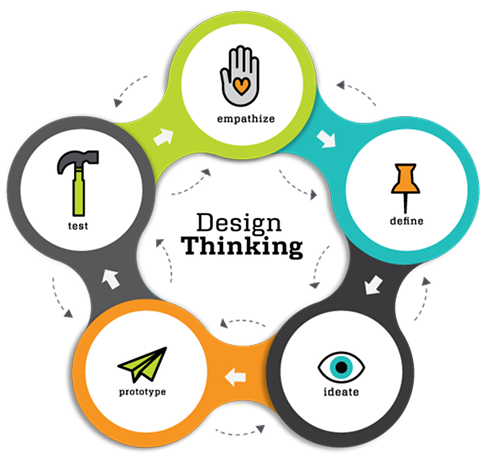
Our design process is a combination of Design Thinking & UCD. Design Thinking provide us ingrediants while UCD help us making a recipe & help how to solve this problem.
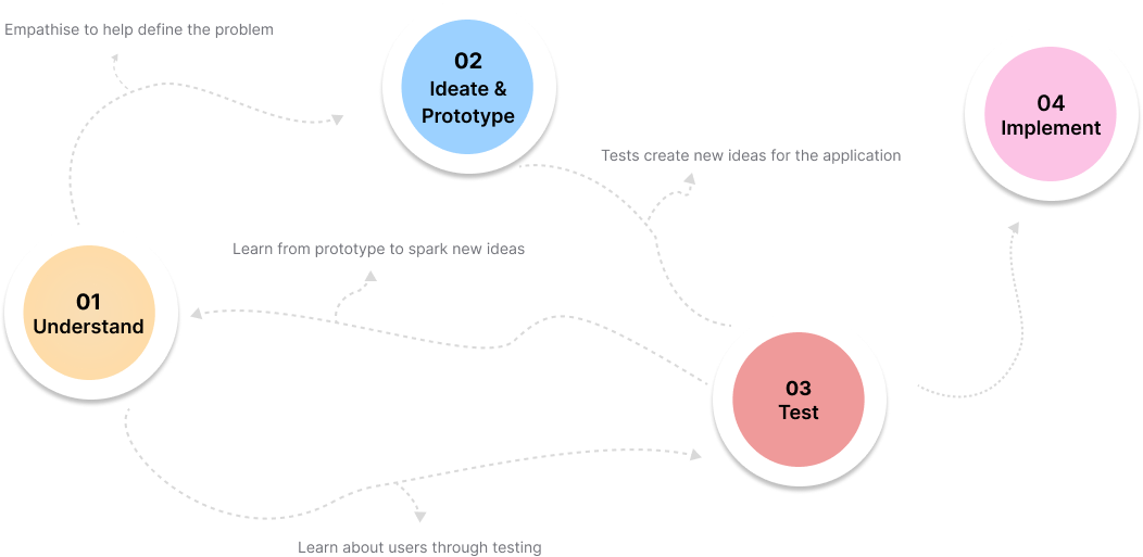
The original Rate It Green platform was rich in content but suffered from outdated navigation patterns, fragmented UI elements, and a lack of cohesive brand expression. The redesign had three primary objectives:
Improve user engagement by introducing intuitive navigation and interactive discussions.
Streamline content discovery to make resources, reviews, and expert insights easier to find.
Elevate the visual design to reflect the innovation and clarity of the green building movement..
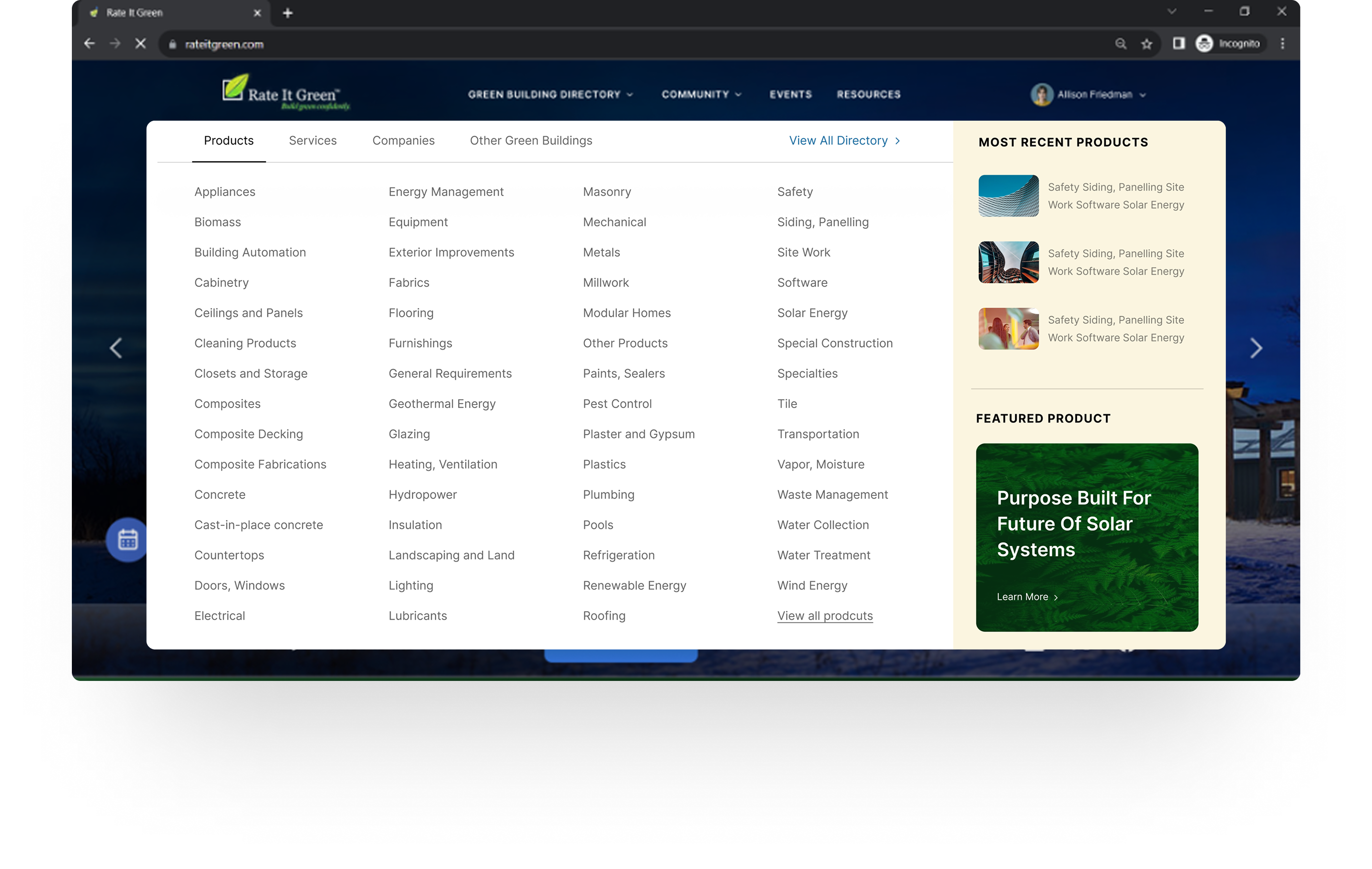
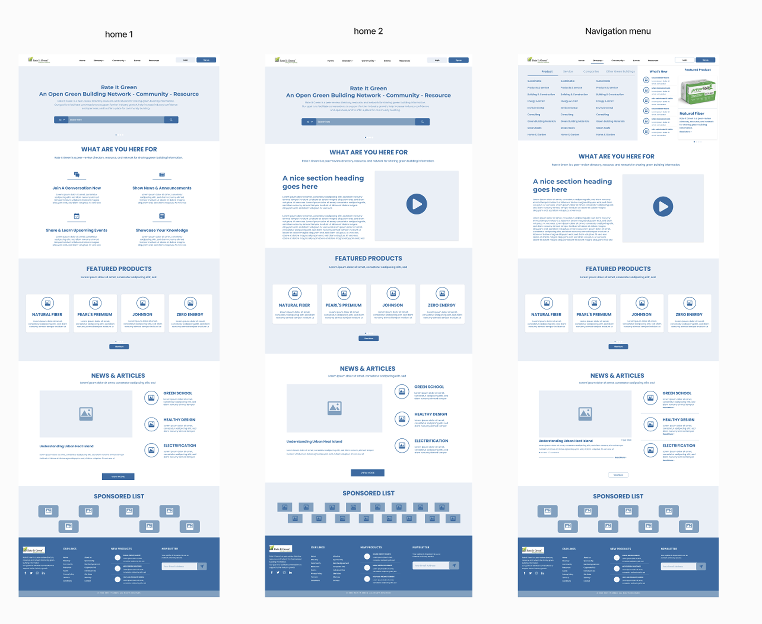
Strategic upgrades included the implementation of a mega menu, restructured information architecture, and a responsive design system to ensure consistency across devices.
Through stakeholder interviews and user testing sessions, we uncovered key pain points:

Users struggled to locate relevant discussions, events, and listings.

The interface lacked clarity and visual hierarchy.

The brand identity no longer reflected the platform’s evolution or mission.
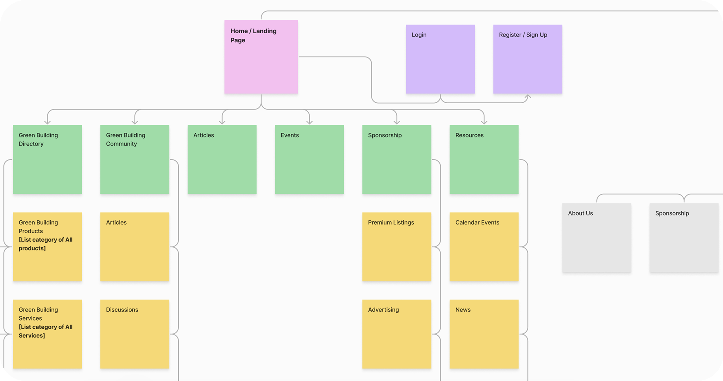

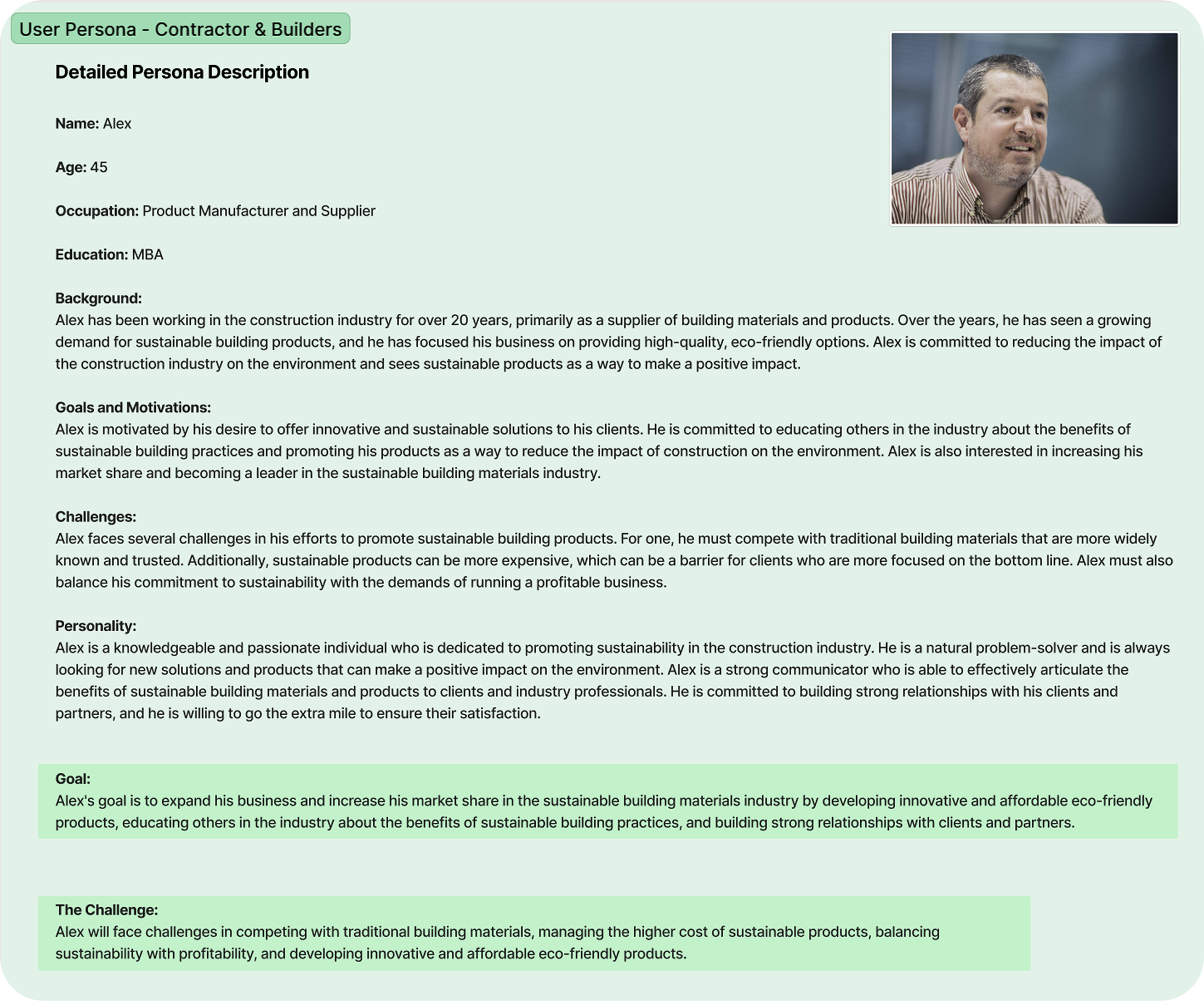
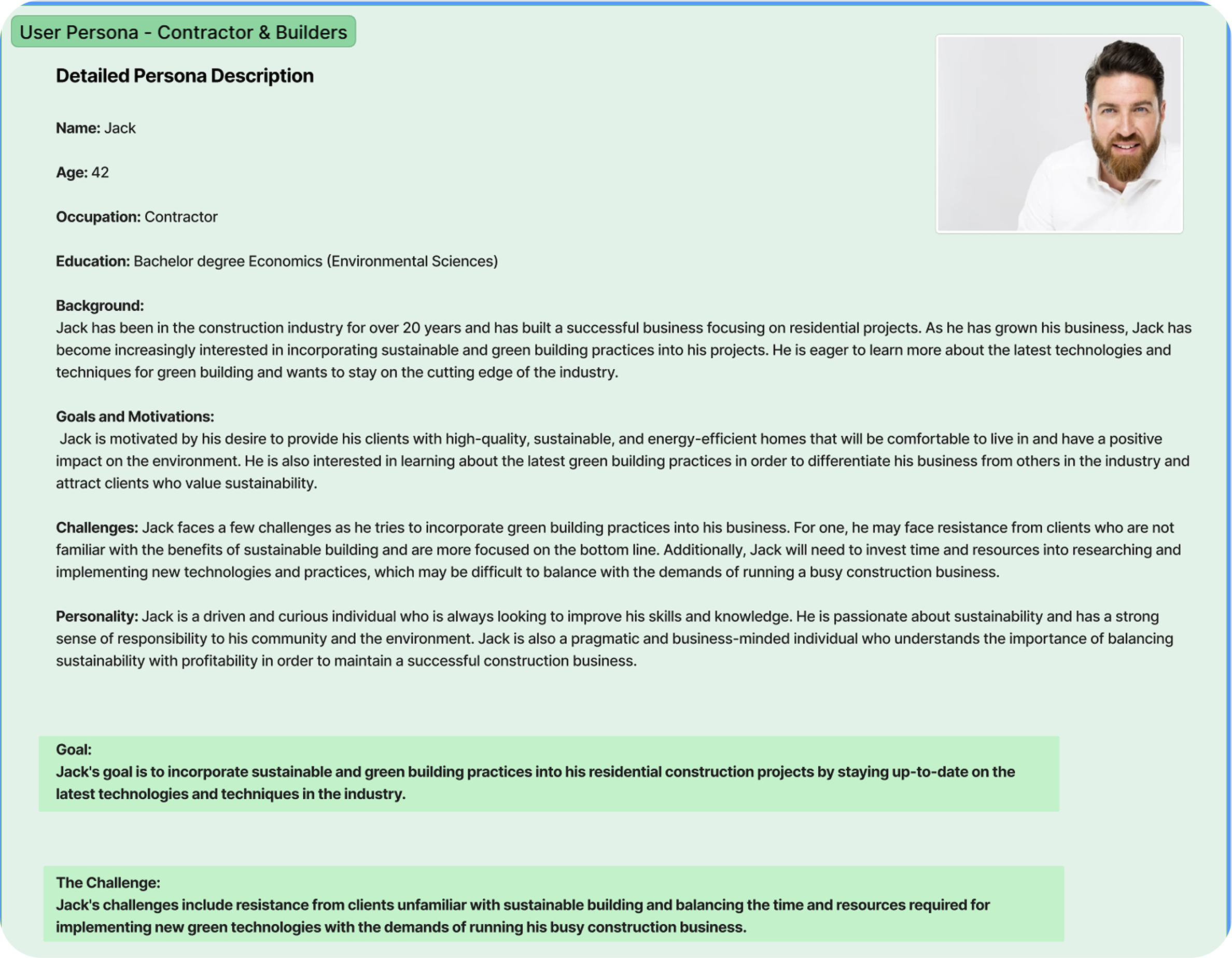
These findings guided the redesign toward a more discoverable and mission-aligned experience.
To support a fresh narrative for Rate It Green, I led a complete rebranding initiative:

Logo Refinement Simplified and modernized for cross-platform consistency.

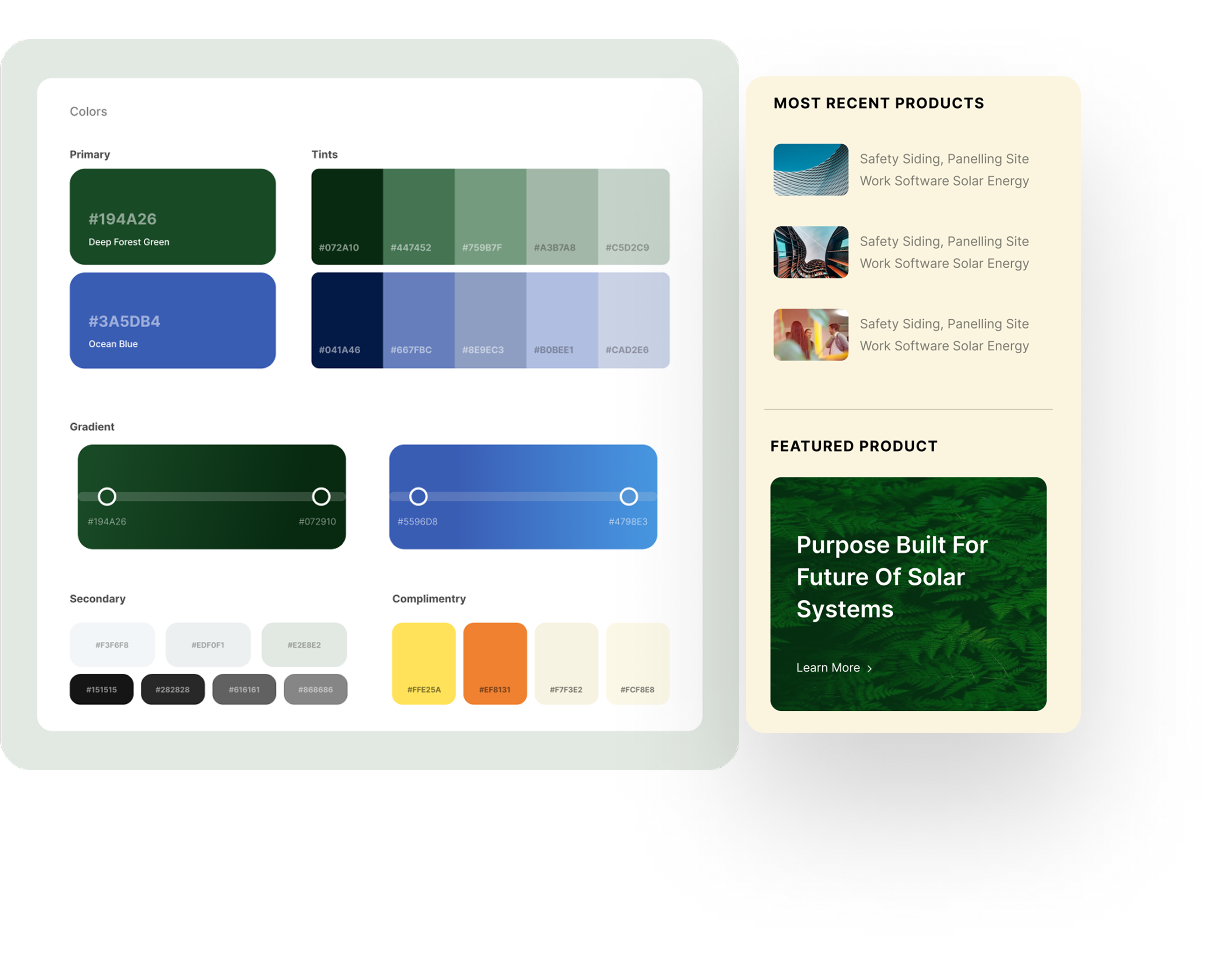
Color Palette Earthy greens, deep forest hues, and clean neutrals.

Typography A balance of legibility and elegance to support dense content.

Voice & Messaging Refined tone to be inviting, authoritative, and community-driven.
The result was a visual identity that echoed sustainability and credibility, while enhancing user trust and emotional connection.
I developed a comprehensive design system in Figma, ensuring design consistency and engineering efficiency:
This system enabled the dev team to ship faster and allowed future feature additions without disrupting visual integrity.
Usability improvements focused on minimizing friction and boosting discoverability:
Mega Menu: Structured access to all major sections, improving time-to-content by 50%.
Search and Filter Tools: Revamped to surface relevant content faster.
Interactive Discussion Threads: Refreshed layout with nested replies, reactions, and moderation tools
Responsive Design: Tailored touch-friendly interactions for mobile users, who made up over 40% of traffic.
Regular design reviews and feedback loops ensured stakeholder alignment throughout.
The redesign delivered tangible improvements across the platform:

User engagement
+62% increase in user engagement, measured through session duration and repeat visits.

Improvement in content
+48% improvement in content discoverability, based on heatmaps and task success rates

Support
Reduced support tickets related to navigation and usability by over 35%.

Mobile bounce rate
Mobile bounce rate dropped by 40%, reflecting stronger mobile-first design impact

Design system
The new design system cut design and development time for new features by 30%.
Rate It Green’s transformation now reflects its position as a thought leader in the sustainable building movement offering a frictionless, informative, and community-first experience.
High-fidelity designs brought the platform to life with detailed visuals and interactive elements. These designs incorporated all previous research and feedback, culminating in a polished and user-friendly interface ready for development.
